
Community Health Access Initiative
Improving access to inclusive and affirming health care resources for LGBTQ+ resources
Role
Designer & Developer
Timeline
Fall 2020 - Winter 2021 (8 Months)
Skills
- User research
- Interaction design
- Visual design
- Mobile design
- Web development
Tools
- Figma
- Webflow
- HTML/CSS
- JavaScript
Overview
I worked to rebuild a mobile and desktop website for the Community Health Access Initiative. The website aims to amplify the voices of LGBTQ+ youth to create a comprehensive health care resource navigator.
I presented my work at the 2021 UMSI Student Exposition and won 1st place for the Diversity, Equity, and Inclusion award out of 50+ teams.
Skip to Solution
Problem
Why is addressing LGBTQ+ health important?
Although there is vibrance in queer spaces, there is also hurt. Youth in the LGBTQ+ community has historically faced numerous health disparities due to stigma, lack of education, and systemic oppression.
😔
63%
LGBTQ+ youth felt sad or hopeless (CDC 2019)
😣
48%
LGBTQ+ youth have considered suicide (CDC 2019)
💊
24%
LGBTQ+ youth misused prescription drugs (CDC 2019)
But there are advocates trying to change those numbers.
The Community Health Access Initiative (CHAI) is a coalition of community organizations, youth, and academic partners offering a free training and technical assistance program to improve the health and well-being of LGBTQ+ youth in Michigan. CHAI is focused on improving mental health and substance use outcomes among LGBTQ+ youth by increasing access to inclusive and affirming health care.
CHAI previously had a website to house tailored health care resources to help achieve their mission, but the disorganization of resources and accessibility errors (lack of color contrast, alternative text, and keyboard navigation) leaves it unusable.
As the designer and developer, I worked with CHAI and a team of UX researchers to redesign the CHAI website for a mobile and desktop platform.
LGBTQ+ youth in Michigan are primary users, and health care providers are secondary users.
Process
Where do I fit unity in community?
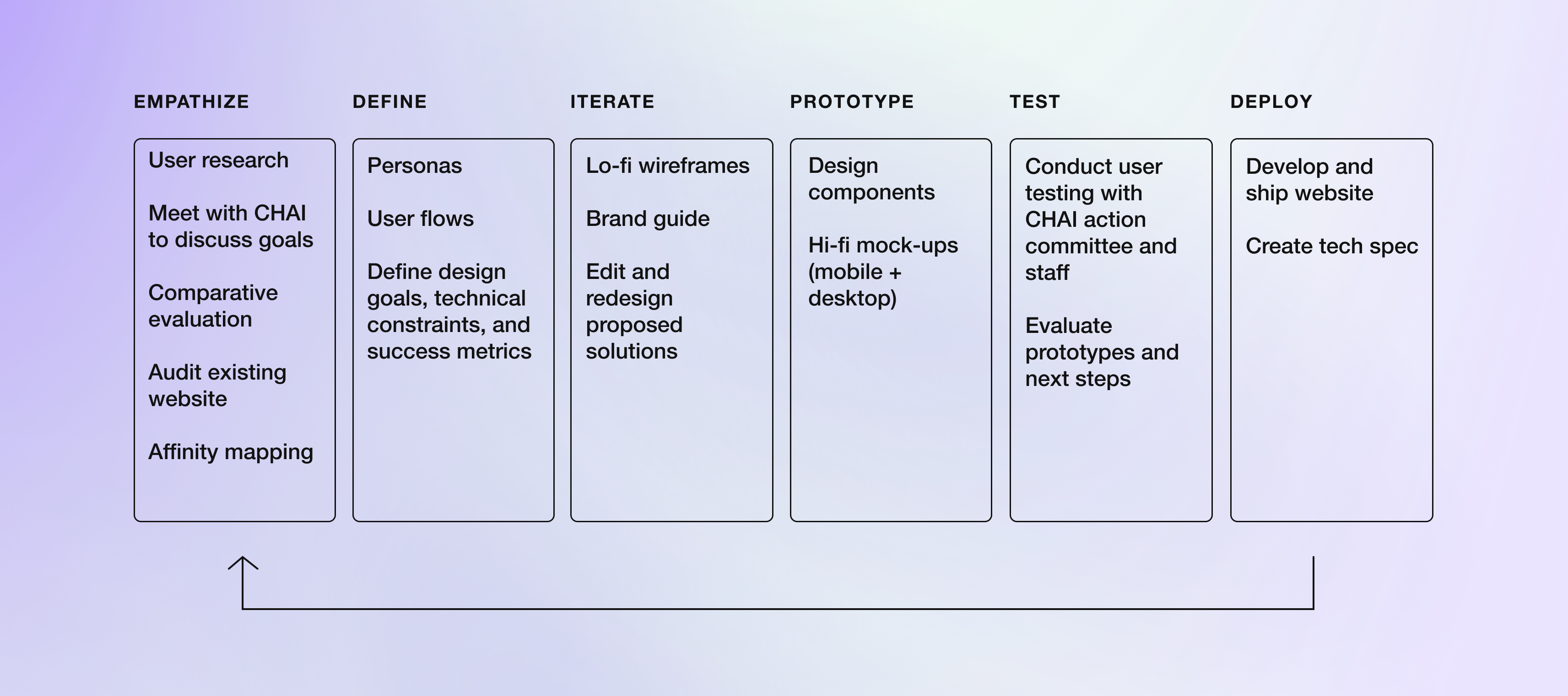
I followed a 6-step design process to synthesize user research and deploy the website. Because the target audience of CHAI is LGBTQ+ youth, I made the process agile and shifted between the different phases to actively involve community members. I was in constant communication with CHAI supervisors and the action committee – LGBTQ+ youth who create and curate CHAI resources and training – to receive feedback through weekly meetings and email.
Research
What are the needs of LGBTQ+ youth?
Method #1: Focus groups – to co-create with the community
Researchers on the team conducted focus group sessions with 13 young LGBTQ+ people in Michigan. Participants in these focus groups answered questions about their needs for an LGBTQ+ website for health care resources and their thoughts about existing health care resources.
The focus group sessions also included a design activity where participants could quickly sketch out mock-ups of an ideal LGBTQ+ health care website for young people. I analyzed and summarized the sketches and find organizational themes.
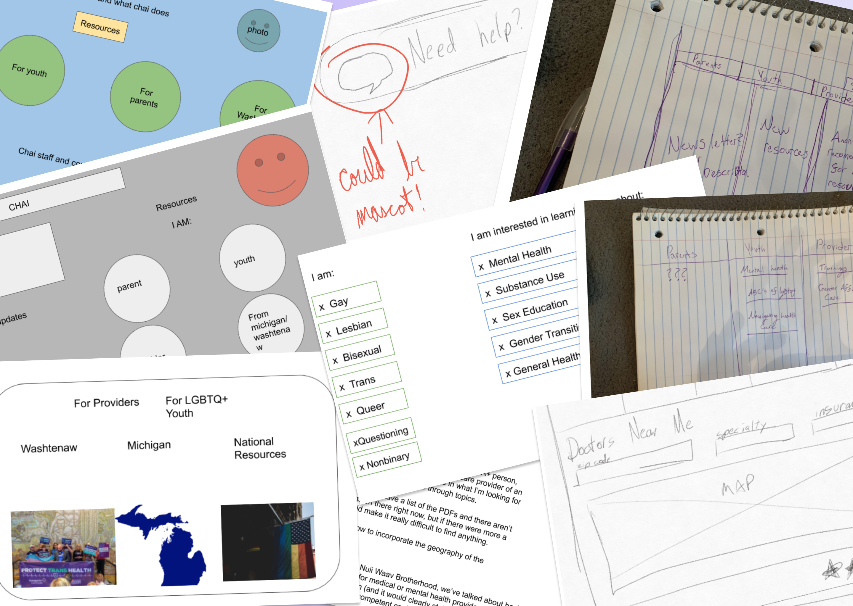
LGBTQ+ youth are looking to browse resources with limited time. Organization looks like:
📋
Lists
🔍
Search functions
🖼
Visual categorization
Method #2: User interviews – to amplify LGBTQ+ voices
5 users, 45 minutes each.
I conducted interviews with CHAI action committee members to understand the specific needs of LGBTQ+ youth and explore their views of the previous CHAI website. I created an affinity map to extract high-level insights and visual patterns.
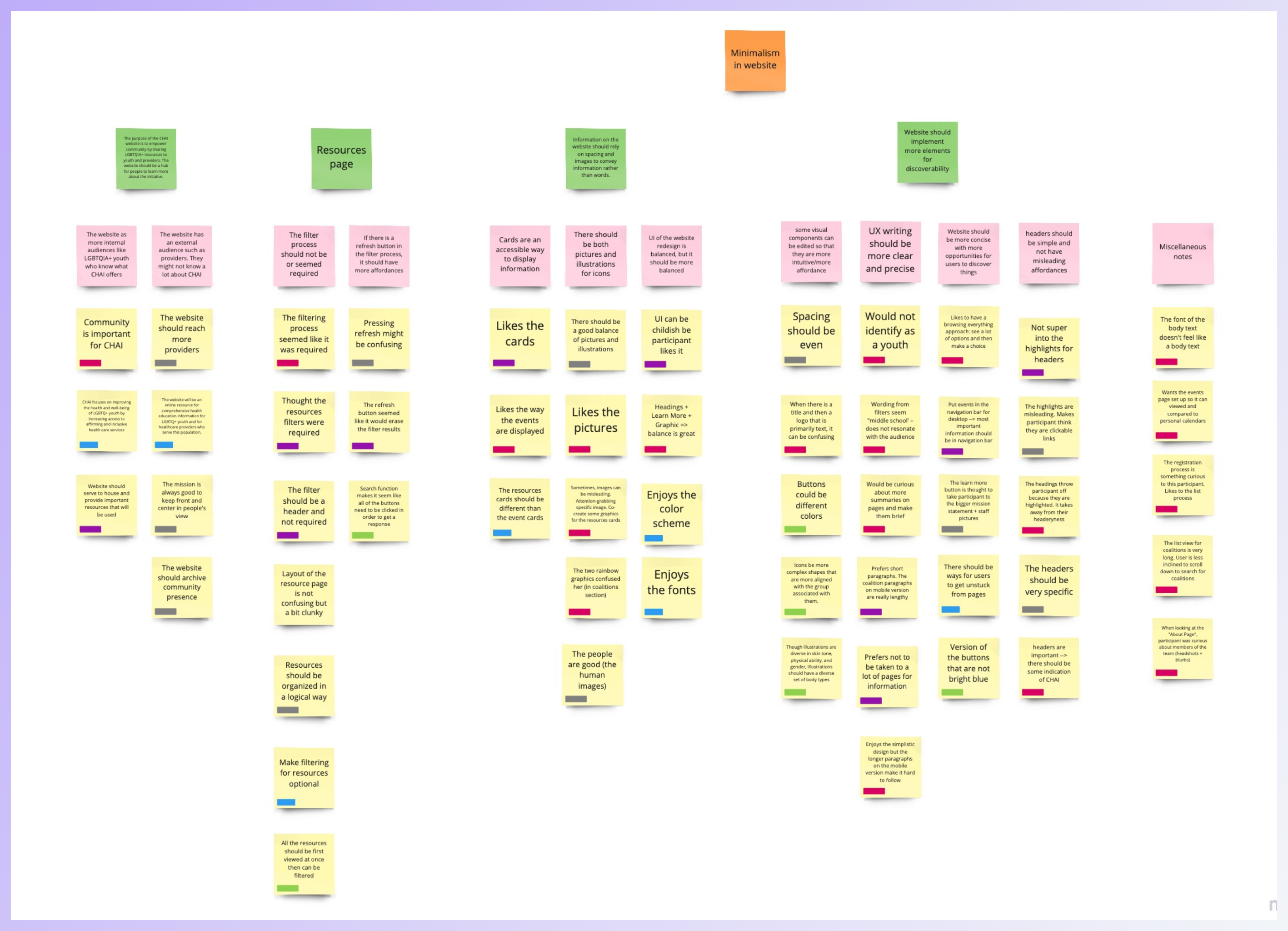
Here’s what the action committee had to say:
- The website should implement more elements for discoverability
- Information on the website should rely on spacing and images to convey information rather than words
- The purpose of the CHAI website is to empower the community by sharing LGBTQ+ resources with youth and providers. The website should be a hub for people to learn more about the initiative
Method #3: Competitive analysis to innovate within the community
I studied three other academic and non-profit organizations that also seek to improve health care and social services for LGBTQ+ youth. The goal was to gain inspiration from their successes and discover areas where I can add value.
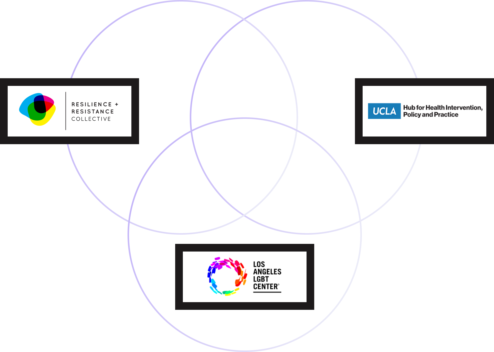
This is the current landscape:
- Websites have a single landing page illustrating their mission and variety of services
- There are multiple ways for users to access the same information within a website
- Resources can be general for all users or tailored for specific audiences (e.g. providers, youth, parents, etc.)
Looking at all of the research, here is how the design was defined:
Because CHAI is a hub of many LGBTQ+ resources,
Goal #1 – Have a centralized page to immediately give users a better understanding of CHAI
Because LGBTQ+ youth are browsing resources with limited time,
Goal #2 – Redesign the website so that users can find resources specific to their needs faster
Because a website like CHAI has multiple audiences,
Goal #3 – Reorganize website information architecture to better showcase resources for a more curated experience
Because LGBTQ+ youth prefer visual organization,
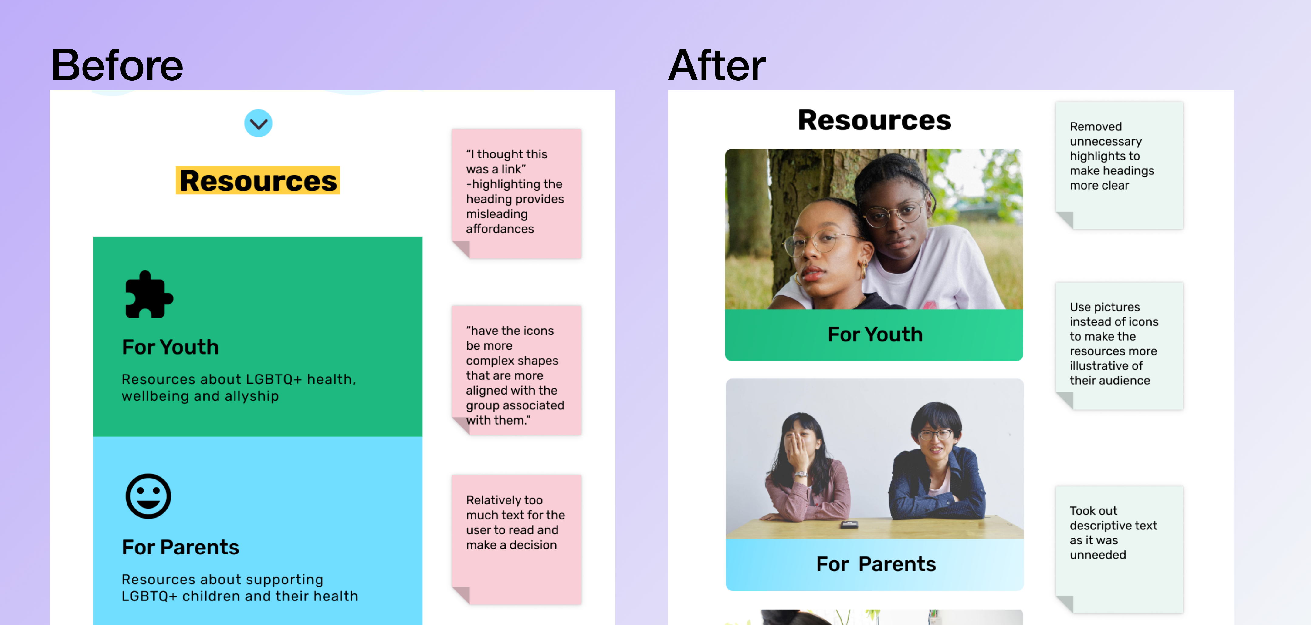
Goal #4 – emphasize imagery while making content accessible
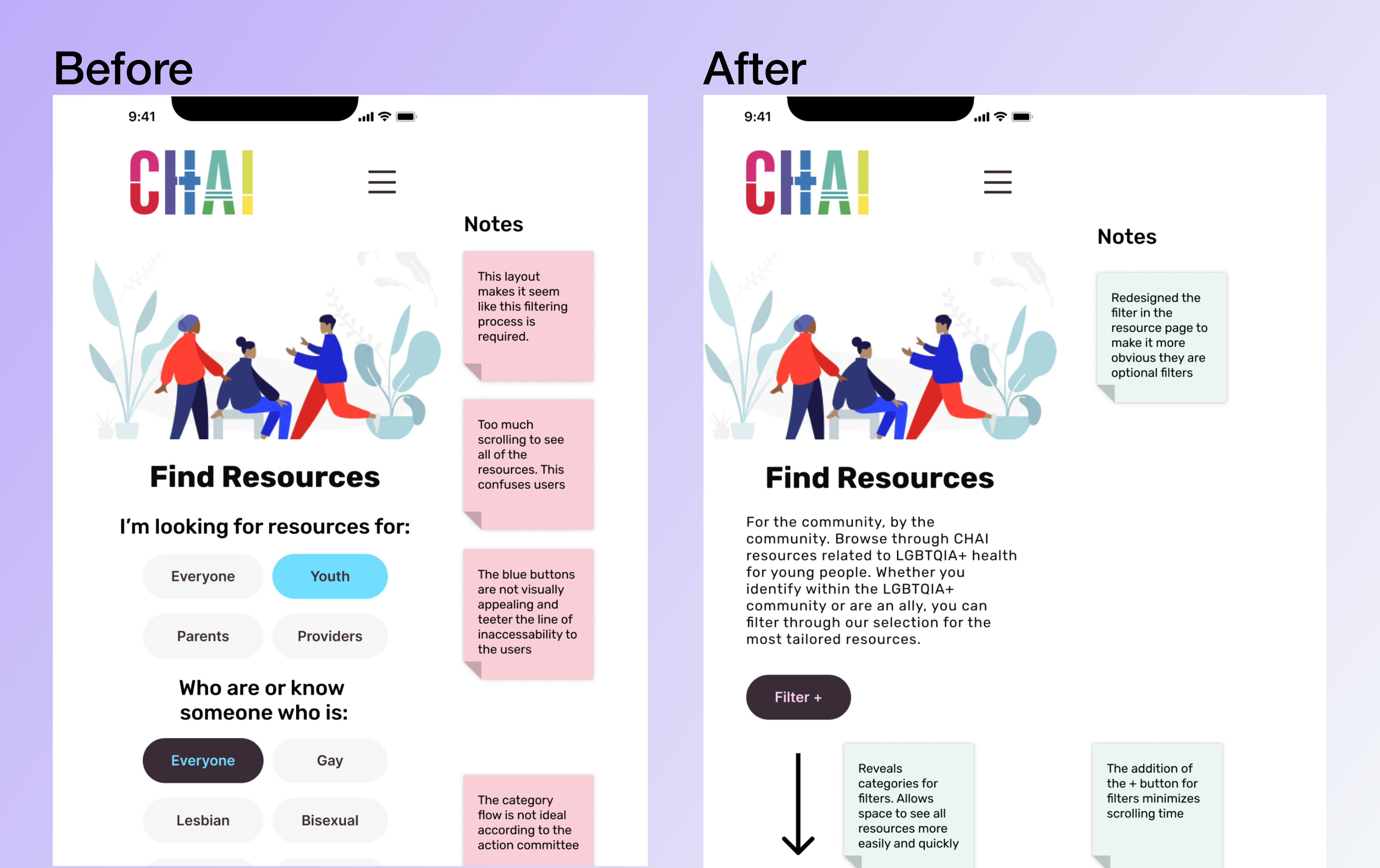
Design Iteration & Prototyping
How do we turn data into decisions?
I iterated over the information architecture of the website and sketched lo-fi wireframes.
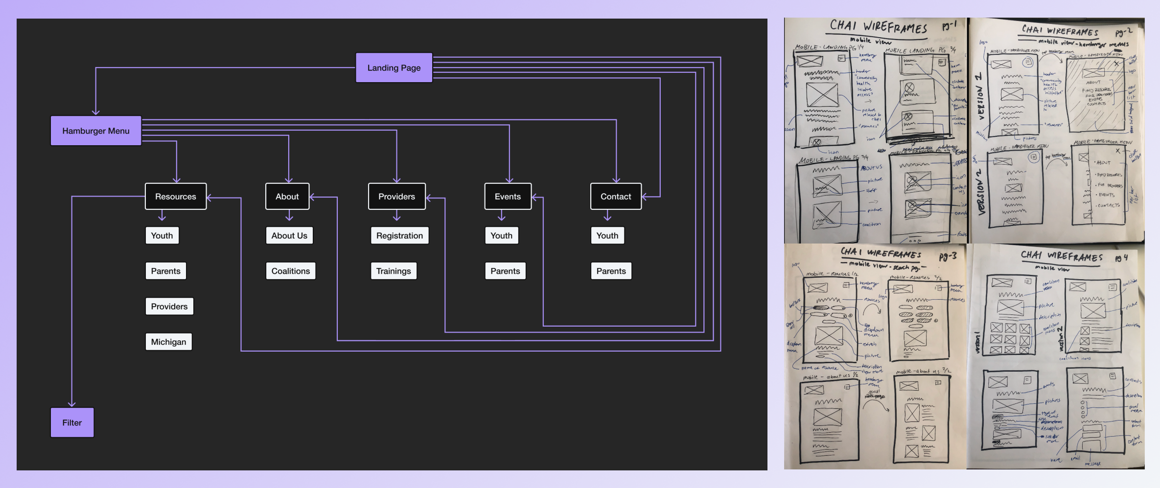
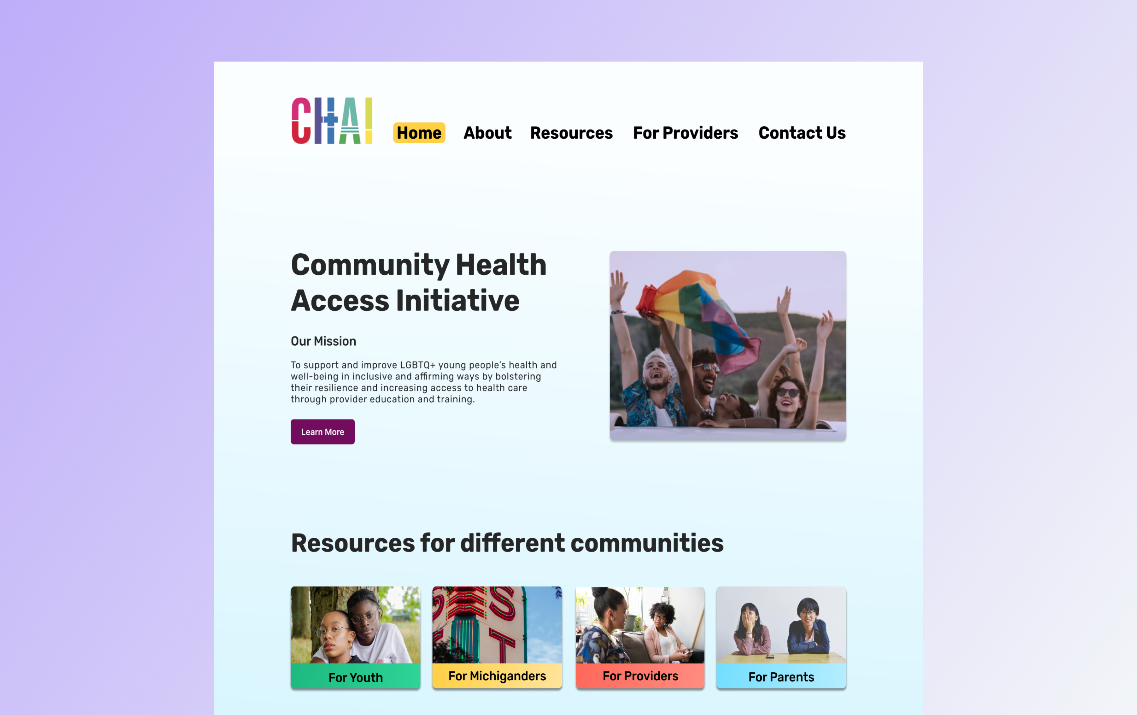
I also recreated the visual branding of the website based on the existing CHAI logo. I used a young, vibrant look to reflect the main audience of LGBTQ+ youth.
To make a robust website, I designed the mobile version before moving onto the desktop version to ensure responsiveness. After receiving feedback from CHAI and the research team, I created a hi-fidelity prototype to test with the action committee. One key performance indicator included task completion for (1) Successfully find specific health care resources and (2) find mental health provider training that is only available to providers.
A turning point
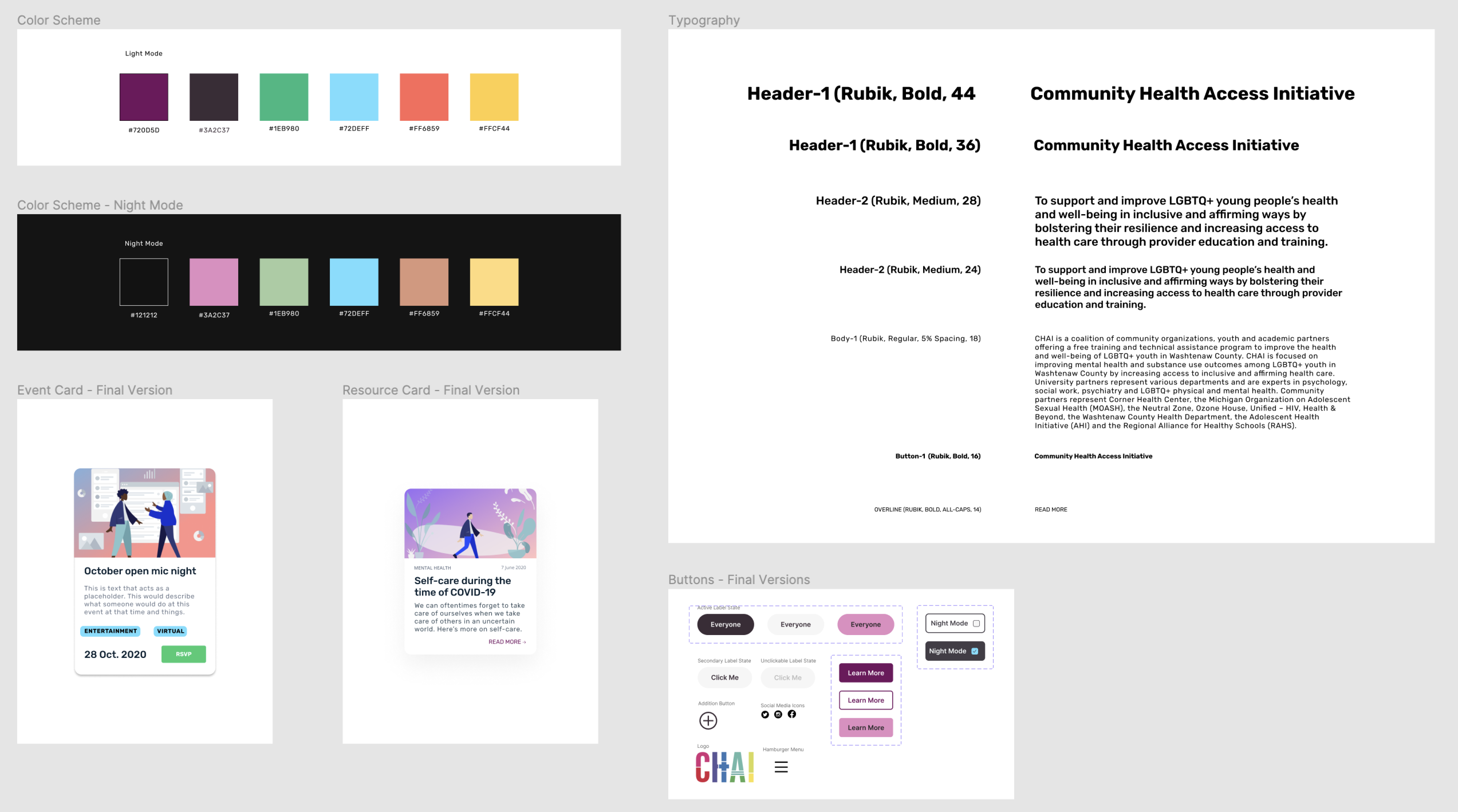
During user testing, critical feedback emerged. The current color scheme was too bright. Though it might seem purely aesthetic, it’s an issue in safety:
Security and privacy
- “The color scheme is bright...I’m not out to my family yet, so I would like a way to make sure that my browsing is discrete.” The website should be designed to encourage the privacy of LGBTQ+ youth
Solution
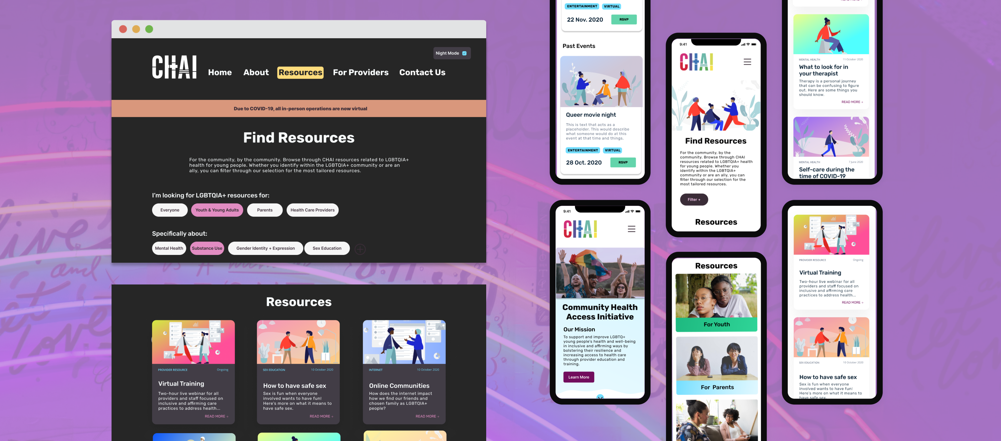
So what's the final product?
A comprehensive landing page
Quickly educate first-time users within seconds and reveal what CHAI offers
Filters and search function
LGBTQ+ youth can pinpoint resources relevant to them without wasting time looking at the ones that aren’t
Multiple pages for multiple audiences
Separate provider and youth content for a more curated experience for different audiences
Night mode
LGBTQ+ youth can safely browse the website without worrying that light emitted from a bright screen will attract attention
Impact & Reflections
How did I create a change?
I developed the website using Webflow and F’in Sweet–a custom vanilla JavaScript framework. I handed off the designs, log-in information, and design specs to CHAI.
Impact
- The redesigned website decreases the time to find specific resources
- I presented my work at the 2021 UMSI Student Exposition and won 1st place for the Diversity, Equity, and Inclusion award out of 50+ teams.
Success & business metrics
I recommended that CHAI look at the following metrics to define success
- Increased clickthrough rate for resources
- Increased registration for CHAI training
Night mode
LGBTQ+ youth can safely browse the website without worrying that light emitted from a bright screen will attract attention
If I had more time
To improve the product, I would have conducted follow-me-home and walkthrough interviews with users to narrow the scope and better define specific health-seeking behaviors that exist among LGBTQ+ youth.
Final thoughts
I am humbled to have the opportunity to work with people of the LGBTQ+ community in Southeast Michigan to improve the health and well-being of LGBTQ+ youth by increasing access to affirming and inclusive health care services. Through the continuous and intentional involvement of the community in the design process to amplify voices of minoritized populations and understand how user needs can directly align with client objectives, I learned how to better design for long-term projects even if resources are limited.